After a few tests, it appears that biological faces are not a strict requirement. Instead, other visual elements are proving to be much stronger candidates for wider algorithmic distribution:
- Abstract, complicated and hand-drawn lines are preferred by Stage B’s system
- Abstract, complicated and hand-drawn lines with some patterns are liked more often by other players
- Photo art without clear contrast between lines and colors do not perform well
We can see the initial outline of this on the second most recent data collection:
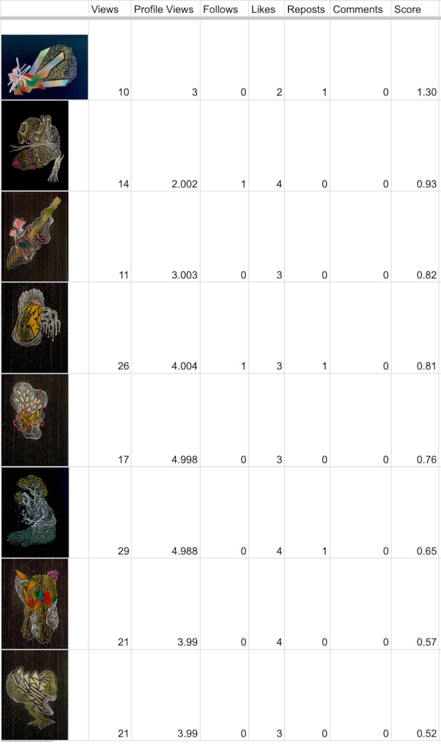
Initially I had assumed faces were important, but more abstract and organic illustrations did better based on the scoring methodology. The formula we use adds multipliers to various engagement data depending on the type and we divide it by the views to get our scores for each post.
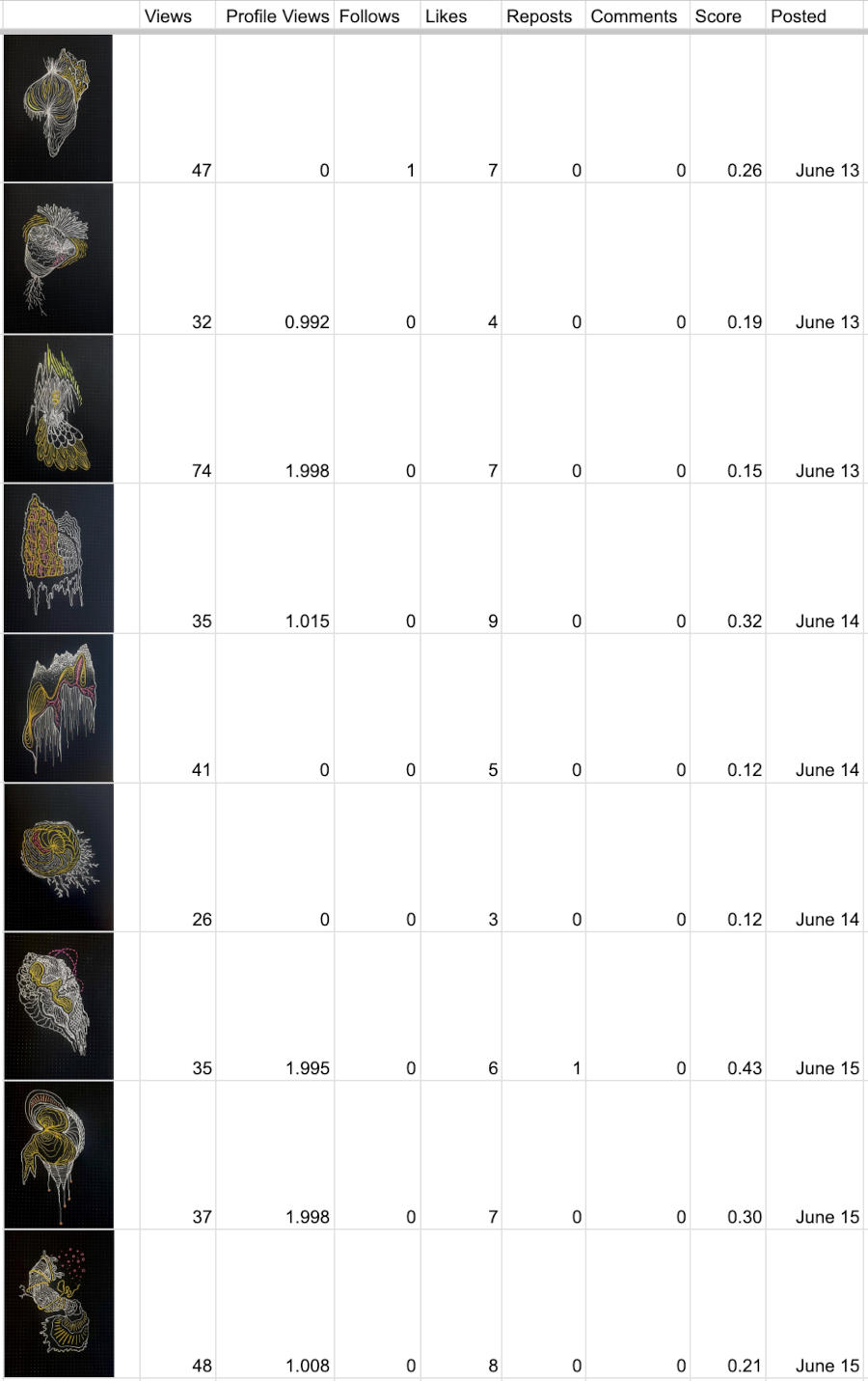
$$ \frac{(\text{Profile Views} \times 2) + (\text{Follows} \times 5) + (\text{Likes} \times 1) + (\text{Reposts} \times 5) + (\text{Comments} \times 3)}{\text{Total Views}} $$Based on these results, I tried another test with more targeted “dailies”, where I post three photo art items per day minimum that are measured for analytics. These are for the last three days of data and we can see a significant change in scoring and dynamics:
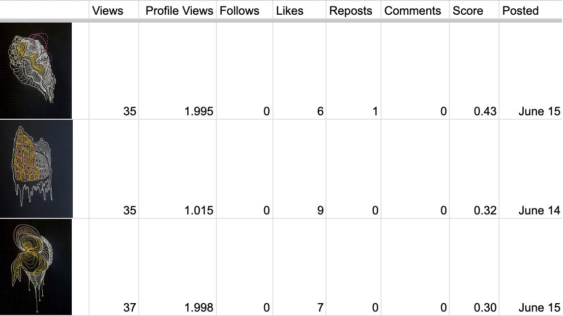
If we sort these by score from highest to lowest and filter to the top three, we see these results:
I see a few patterns to test for the following week:
- More line work on the canvas vs less (negative space isn’t rewarded as much, but this is just my guess, not a confirmation)
- Line work has to vary in style (too consistent isn’t as engaging)
- Output that looks like abstract maps?
So the idea now is to test the abstract map illustration path with the above constraints. We’ll see what results these bring next!